
In this digital age, email marketing continues to be an effective strategy for businesses to connect with their customers. Central to every successful email marketing campaign is a persuasive Call to Action (CTA).
A CTA is not just a mere button or link—it serves as a bridge to potential conversions, steering your customers from awareness to purchase. However, creating a powerful CTA goes beyond just a catchy phrase; it necessitates a profound understanding of your audience, your product, and the objectives of your email campaign.
This article will delve into the best practices for designing CTAs that not only grab attention but also prompt action and yield results. Whether you’re a novice in email marketing or seeking to enhance your strategy, these insights will provide you with the necessary tools to maximize your CTAs.
So, let’s get started and transform those clicks into conversions!
What exactly is a Call To Action (or CTA)?
A Call To Action, commonly known as a CTA, is a term used in marketing that signifies an instruction aimed at prompting the user to carry out a specific action. It’s a vital component on a webpage, within an email, or in any other type of marketing communication. CTAs are crafted to guide users towards achieving your desired conversion.
It’s the segment of the advertisement or promotional content that motivates the audience to act. This action could range from subscribing to a newsletter, downloading a document, participating in a webinar, or making a purchase.
CTAs hold significance as they stimulate your audience to interact with your content in a manner that propels them along the sales funnel. They can also offer your audience a sense of direction by indicating what action they should undertake next and how to go about it.
In a nutshell, a CTA acts as a link between the marketing message and the ultimate objective of the marketing strategy, be it making a sale, generating a lead, or gathering user data for future marketing endeavors. It’s a critical element in gauging the effectiveness of a marketing campaign.
How CTAs can drive customer engagement and conversions?
Call To Actions (CTAs) are instrumental in fostering customer engagement and driving conversions. They act as the ‘push’ that motivates users to engage with your email content, thereby boosting engagement.
Here’s how CTAs can foster customer engagement and drive conversions:
1. Guiding User Path
Call To Actions (CTAs) are integral in guiding users through the marketing funnel, a model that depicts the theoretical journey of a customer towards the purchase of a product or service.
Here’s how CTAs navigate users through different phases of the marketing funnel:
- Awareness Phase: This is the initial phase where potential customers become acquainted with your brand or products. CTAs in this phase are designed to draw users and spark interest. Examples include CTAs like “Discover More” or “Explore More” that direct users to additional content about the brand or product.
- Evaluation Phase: In this phase, potential customers are weighing their options. CTAs here aim to engage users further and establish a relationship. Examples include “Register for a Webinar” or “Download Our Complimentary E-Book”.
- Decision Phase: This is the final phase where potential customers are prepared to make a purchase. CTAs in this phase are designed to elicit an immediate response. Examples include “Purchase Now”, “Add to Basket”, or “Begin Free Trial”.
- Retention Phase: Post-purchase, the objective is to retain the customer and foster loyalty. CTAs in this phase might include “Recommend a Friend and Receive 20% Off” or “Provide a Review”.
By steering users through these phases, CTAs assist in moving potential customers down the funnel, ultimately leading to conversions and customer retention.
They offer clear, actionable steps for users to undertake, making the journey from discovery to decision as effortless as possible.
2. Prompting Immediate Action
Incorporating a sense of urgency in your Call To Action (CTA) can be an effective strategy to elicit immediate action from your audience. Here’s how it operates:
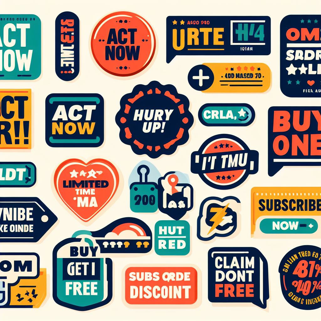
- Promotes Immediate Response: Urgency persuades individuals to act swiftly. When users encounter a CTA with phrases like “Offer Ends Soon” or “Act Fast, Sale Concludes Soon”, they are more inclined to take immediate action to avoid missing out.
- Generates Scarcity: CTAs that instill a sense of urgency often achieve this by generating a sense of scarcity. Expressions like “Available While Stocks Last” or “Only a Limited Quantity Remaining” can make the offer appear scarce, augmenting its perceived value and making users more likely to convert.
- Minimizes Procrastination: When confronted with a decision, many individuals tend to procrastinate. However, a sense of urgency can propel users to make an immediate decision. This is particularly effective in the decision phase of the marketing funnel.
- Boosts Conversion Rate: Ultimately, the objective of any CTA is to boost conversions. By creating a sense of urgency, you’re not just enhancing the likelihood of users clicking on your CTA, but also of them proceeding with a purchase or sign-up.
Bear in mind, while creating a sense of urgency can be a potent strategy, it’s crucial to employ it judiciously. Excessive use can lead to skepticism and diminish the effectiveness of your CTAs.
Click here to preview fresh & verified prospects
3. Improving User Experience
A well-crafted Call To Action (CTA) can significantly enhance the user experience by making navigation more straightforward. Here’s how:
- Explicit Guidance: An effective CTA offers users explicit guidance on their next course of action, eliminating any ambiguity. This can make navigating your website or email much more straightforward and intuitive.
- Smooth Journey: By directing users to their subsequent step with a CTA, you can facilitate a smooth journey. This can prevent users from feeling lost or frustrated, thereby enhancing their overall experience.
- Aesthetic Appeal: A well-crafted CTA isn’t just about the verbiage used; it’s also about the visual elements. An aesthetically pleasing CTA can attract users and make navigation more enjoyable.
- Inclusivity: Good CTAs are designed with inclusivity in mind, ensuring that all users, including those with disabilities, can easily navigate your content.
- Uniformity: Consistent use of CTAs throughout your content can help users know what to anticipate, making navigation easier and more seamless.
In essence, a well-crafted CTA does more than just elicit action—it also plays a pivotal role in creating a positive and effortless user experience.
4. Facilitating Decision Making
Call To Actions (CTAs) are vital elements in directing users towards making choices, be it subscribing to a service, purchasing an item, or opting to explore more about what you offer.
CTAs are usually designed to be eye-catching, employing persuasive language and visually appealing design elements. They are strategically positioned on a webpage, email, or advertisement to capture user attention and encourage them to perform a specific action.
Here’s a breakdown of the key aspects of CTAs:
- Objective: The main objective of a CTA is to steer users towards achieving a goal conversion. This could range from subscribing to a newsletter, completing a purchase, downloading a document, or filling out a form.
- Design: CTAs should be visually appealing and easy to spot. They often employ vibrant colors, bold fonts, and clear directives to guide users.
- Language: The language used in a CTA is typically action-oriented. It prompts users to take immediate action, using verbs such as “Buy Now”, “Sign Up”, or “Learn More”.
- Placement: The location of a CTA can significantly influence its effectiveness. It should be positioned in a noticeable location where users can easily spot it, often at the end of a content piece or near the top of a webpage.
In summary, CTAs are a potent tool for directing user behavior and boosting conversion rates. They are a critical component of effective user interface design and digital marketing strategies.
Click here to preview fresh & verified prospects
5. Gauging Success
Call To Actions (CTAs) are not just guiding lights leading users to make decisions, they also serve as a tangible method to gauge the success of your marketing initiatives.
CTAs play a pivotal role in digital marketing analytics. They offer marketers a way to measure the effectiveness of their campaigns through user interaction tracking. Here’s how:
- Tracking Conversions: By observing the number of users who click on a CTA and carry out the desired action (such as making a purchase or subscribing to a newsletter), marketers can determine the conversion rate of their campaigns.
- A/B Testing: Marketers can experiment with different versions of a CTA (changing the wording, color, size, or placement) to identify which one yields better results. This aids in refining the CTA for maximum impact.
- Assessing User Engagement: CTAs can serve as a metric for user engagement. For example, a high click-through rate on a CTA may suggest that users are highly engaged with the content.
- Evaluating Traffic Sources: By identifying which CTAs are most effective, marketers can also evaluate which traffic sources (such as social media, email marketing, or search engine optimization) are leading to the most conversions.
- Calculating ROI: By comparing the number of conversions resulting from a CTA to the cost of the campaign, marketers can compute the return on investment (ROI) of their marketing initiatives.
In summary, CTAs provide a practical, quantifiable method for monitoring the success of marketing efforts, offering insights that can aid in optimizing future campaigns. They are a critical component in the toolkit of digital marketing strategies.
Creating Excellent CTAs | Best Practices
Below are the best practices for designing powerful calls to action that captivate your audience and motivate them to take desired actions.
Uncover the secrets behind successful CTAs and learn how to incorporate these techniques into your own content
1. Clarity is Key
The importance of making the CTA clear and easy to understand
The significance of a clear and straightforward Call to Action (CTA) cannot be overstated. A CTA that is easy to understand ensures that your audience knows precisely what is expected of them, removing any potential ambiguity or doubt.
This not only enhances the user experience but also boosts the chances of your audience responding positively to the CTA, leading to conversions and achieving your goals. Whether it’s subscribing to a newsletter, buying a product, or downloading a guide, a well-designed CTA can dramatically increase engagement and success rates.
As such, dedicating time and effort to create clear and easy-to-understand CTAs is a best practice that can deliver significant results.
Examples of clear and confusing CTAs
let’s delve into some examples of both clear and ambiguous CTAs:
Transparent CTAs:
- “Buy Now”: This CTA is direct and informs the user of the exact action to take – proceed with a purchase.
- “Sign Up for Free Trial”: This CTA clearly communicates what the user will receive – a complimentary trial of a service.
- “Download the E-book”: This CTA is unambiguous – the user is aware they’ll be downloading an e-book.
Ambiguous CTAs:
- “Go Ahead”: This CTA is unclear and doesn’t indicate the specific action the user should undertake.
- “See More”: While this CTA suggests there’s additional content, it doesn’t specify what ‘more’ encompasses. More products? More details? More visuals?
- “Let’s Do This”: This CTA, though catchy, doesn’t clearly define what ‘this’ entails. It could imply anything from registering for a service to filling out a survey.
The primary objective of a CTA is to steer users towards a particular action. Hence, it’s vital to ensure your CTAs are as transparent and specific as possible to eliminate any confusion and enhance the likelihood of the user performing the intended action.
Click here to preview fresh & verified prospects
2. Use Actionable Language
Why CTAs should start with a strong command verb.
Initiating a Call to Action (CTA) with a potent command verb is essential for a few key reasons:
- Directness: Potent command verbs offer clear guidance to users about the action they need to undertake. For instance, terms like “Download”, “Register”, or “Purchase” instantly communicate to the user the action they are anticipated to perform.
- Immediacy: Command verbs can instill a sense of immediacy, prompting users to act without delay. This can be especially effective in scenarios that are time-sensitive or involve limited-time offers.
- Involvement: Utilizing action-oriented language can render your CTA more engaging and persuasive. It can help captivate users and arouse their curiosity.
- Influence: Lastly, commencing with a potent verb can render your CTA more influential and memorable, augmenting the probability that users will respond to it.
Examples of actionable language
Actionable language involves the use of robust, explicit, and succinct verbs that incite the reader to execute a particular action. Here are some instances:
- “Download Instantly”: This phrase is straightforward and urges the user to download a file or document immediately.
- “Register Today”: This phrase propels the user to sign up for a service or newsletter, emphasizing that the action should be taken today.
- “Become a Member”: This phrase invites the user to join a community or group.
- “Begin Now”: This phrase motivates the user to initiate a process or task.
- “Discover More”: This phrase encourages the user to acquire additional information.
- “Place in Cart”: This phrase is frequently used on e-commerce sites to prompt the user to add a product to their shopping cart.
- “Reach Out to Us”: This phrase invites the user to contact for more details or support.
Keep in mind, the objective of actionable language is to steer the user towards a desired action in a lucid and compelling manner.
3. Create a Sense of Urgency
Crafting a sense of urgency in your Call to Action (CTA) can be an effective method to boost user engagement and conversions. Here are some tactics to accomplish this:
- Incorporate Time-Bound Phrases: Utilize terms like “immediately”, “today”, “limited period”, or “rush” to instill a sense of urgency and incite users to take action without delay.
- Highlight Limited Stock: If your offer is restricted in quantity or availability, emphasize this in your CTA. Expressions like “until stocks last” or “only X items remaining” can propel users to act swiftly.
- Advertise Exclusive Offers: Exclusive or time-bound offers can create a sense of scarcity and urgency. Accentuate the exclusivity of your offer in your CTA to encourage prompt action.
- Employ FOMO (Fear of Missing Out): FOMO is a potent motivator. Use language that implies users might lose out on an excellent opportunity if they don’t act promptly.
- Use Action-Oriented Verbs: Initiate your CTA with a robust action verb to clearly convey the action you desire users to undertake.
- Emphasize Immediate Advantages: If users can perceive an immediate benefit or outcome from taking action, they’re more likely to do so. Ensure to communicate these advantages in your CTA.
The objective is to make your audience feel the need to act instantly. Experiment with different strategies to identify what resonates best with your audience and continually fine-tune your CTAs based on your observations.
Click here to preview fresh & verified prospects
4. Make it Stand Out
Effectively designing and positioning a Call to Action (CTA) is vital for its success. Here are some guidelines:
Designing the CTA:
- Color and Contrast: The CTA button should distinguish itself from the rest of the page. Employ contrasting colors to make it prominent.
- Size: The CTA button should be noticeable but not so large that it dominates the rest of the content.
- Shape: While the shape of the button isn’t as critical as color or size, it should still be recognizable as a clickable button.
- Text: The text on the CTA button should be explicit, succinct, and action-oriented. It should inform users precisely what they’ll receive if they click.
Positioning the CTA:
- Above the Fold: Positioning the CTA above the fold (the portion of the webpage visible without scrolling) can enhance visibility.
- Alignment with Eye Movement: People typically scan webpages in an “F” or “Z” pattern, so positioning your CTA along these lines can increase its likelihood of being noticed.
- Adjacent to Relevant Content: If the CTA is pertinent to specific content on your page, position it close by to establish a connection for the user.
- End of Content: If your content is particularly engaging, positioning a CTA at the end can leverage the user’s engagement.
The objective is to make the CTA as conspicuous and appealing as possible to encourage users to click.
5. Keep it Simple
Make CTA straightforward and easy to follow
Ensuring your Call to Action (CTA) is straightforward and easy to follow is key for effective user engagement. Here are some strategies:
- Adopt Clear Language: Steer clear of technical jargon or complicated language. Your CTA should be comprehensible to everyone, irrespective of their background or knowledge level.
- Be Precise: Inform your users exactly what action they need to undertake and what they will receive. For instance, instead of merely saying “Click Here”, use “Download Your Complimentary E-book Instantly”.
- Maintain Brevity: An effective CTA typically comprises no more than five to seven words. Keeping it brief ensures that the message is easily absorbable and quickly comprehended.
- Employ Actionable Verbs: Initiate your CTA with a robust action verb. This immediately informs users of the action they should execute.
- Design is Crucial: Ensure your CTA button is sufficiently large to be easily clicked, especially on mobile devices. Use colors that distinguish from the rest of your website to attract attention to the CTA.
Remember, the objective of a CTA is to guide users towards a specific action. Making it straightforward and easy to follow can significantly augment your conversion rates.
Click here to preview fresh & verified prospects
Examples of simple and complex CTAs
Let’s delve into some examples of both simple and complex CTAs:
Simple CTAs:
- “Purchase Now”: This is a direct CTA that clearly instructs the user on the action to undertake.
- “Register”: This CTA is uncomplicated and straightforward, prompting users to sign up for a service or a newsletter.
- “Discover More”: This CTA encourages users to acquire more information, typically leading them to another page with additional details.
Complex CTAs:
- “Save on Your Subsequent Purchase by Registering for Our Newsletter”: This CTA not only requests users to sign up for a newsletter, but also emphasizes the advantage of saving on future purchases.
- “Become a Member Today and Commence Learning with Thousands of Enthusiasts Like Yourself”: This CTA is more intricate as it invites users to join a community, underscores the immediate availability of the service (“today”), highlights the benefit (learning), and creates a sense of belonging by mentioning “thousands of enthusiasts like yourself”.
- “Receive Your Complimentary E-book Instantly and Gain Exclusive Access to Weekly Tips and Tricks”: This CTA offers multiple incentives (a complimentary e-book and exclusive access to tips and tricks), making it more intricate and potentially more enticing.
Remember, whether a simple or complex CTA is more effective can depend on various factors such as your audience, the context, and the specific action you want users to undertake.
It’s always a prudent idea to experiment with different CTAs to identify what resonates best with your situation.
6. Testing and Improving Your CTAs
Importance of A/B testing for CTAs
A/B testing, also known as split testing, is vital for optimizing Calls to Action (CTAs) due to several reasons:
- Assessing Performance: A/B testing enables you to juxtapose two versions of a CTA to ascertain which one yields better results. This can offer valuable insights into what appeals to your audience.
- Enhanced Conversions: By determining which CTA leads to higher click-through rates or conversions, you can optimize your CTAs to enhance overall performance.
- Mitigated Risk: Implementing changes to CTAs based on assumptions can be risky. A/B testing mitigates this risk by providing data-backed evidence on what is effective and what isn’t.
- Deeper Understanding of User Behavior: A/B testing can unveil patterns in how users interact with your CTAs, aiding you in understanding their preferences and behaviors better.
- Ongoing Improvement: A/B testing fosters a culture of ongoing improvement and data-driven decision making. It allows you to make incremental changes and continuously test and optimize your CTAs.
In conclusion, A/B testing is a crucial tactic for enhancing the efficacy of your CTAs and should be a fundamental part of your optimization strategy.
Click here to preview fresh & verified prospects
Tips on what elements to test and how to measure success
When conducting A/B testing for your Call to Action (CTA), there are several components you might consider testing, and various ways to gauge success:
Components to Test:
- Terminology: Experiment with different action verbs or phrases to identify which connects more with your audience.
- Design: Test different colors, dimensions, or forms for your CTA button.
- Location: Attempt positioning your CTA in various spots on your page to determine where it garners the most attention.
- Urgency: Test CTAs with and without a sense of urgency to ascertain which drives more conversions.
Gauging Success:
- Click-Through Rate (CTR): This is the ratio of users who click on your CTA to the total number who view it. A higher CTR usually signifies a more effective CTA.
- Conversion Rate: This is the ratio of users who complete the desired action after clicking on the CTA. It’s a crucial indicator of the effectiveness of your CTA and the subsequent user journey.
- Bounce Rate: This is the ratio of users who exit your page without interacting with the CTA. A high bounce rate might signify that your CTA is not appealing or relevant to visitors.
- Time on Page: If users spend an extended period on your page, it might indicate that they’re more engaged and therefore more likely to respond to your CTA.
Remember, the objective of A/B testing is to discover what resonates best with your specific audience and context. What works well for one website or audience might not work as well for another. Always base your decisions on data and persistently test and optimize.
Conclusion
To wrap up, creating an effective Call to Action (CTA) is a pivotal aspect of successful email marketing. By adhering to best practices above, marketers can significantly boost their email engagement rates.
Moreover, ongoing A/B testing allows for the optimization of CTAs based on user behavior and preferences, leading to improved click-through and conversion rates.
Ultimately, a well-designed CTA can serve as a potent tool in converting email recipients into customers, thereby driving business growth. Remember, the secret lies in understanding your audience and persistently fine-tuning your CTAs to provide them with value.